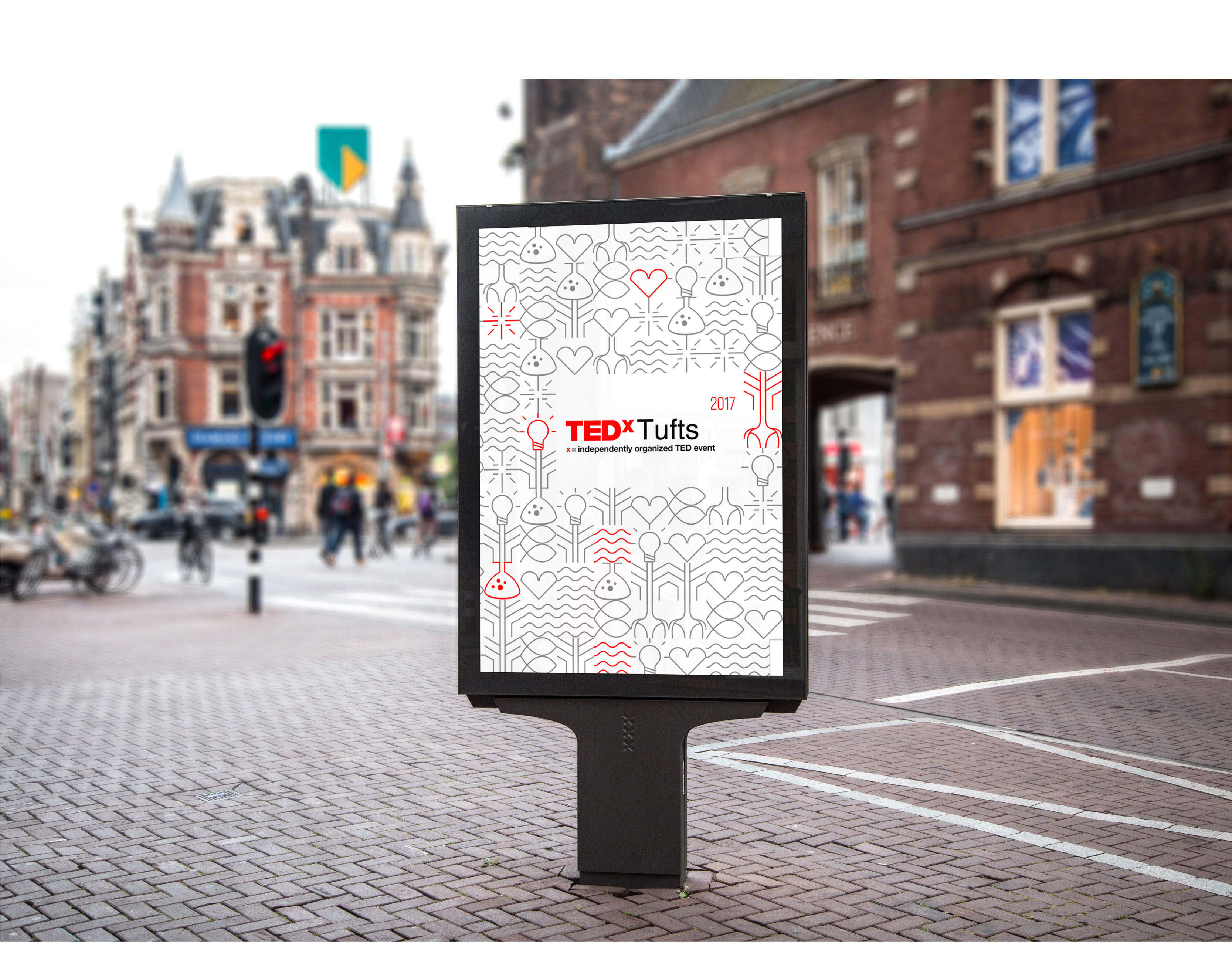
As design director for TEDxTufts 2018, I led my team to create a design identity that visually represented our theme. To ensure coherence in our design, I developed a set of branding guidelines for TEDxTufts, based on similar documentation by TED and TEDx.
The theme for the 2018 event was Re: Vision, a play on the words "vision" and "revision." This wordplay was meant to convey the perspective shifts and changes that TEDx talks can bring.
For the 2018 event, I wanted to place more emphasis on individual speaker's talks. Thus, I played with the idea of representing each talk as an icon - this idea first began with graphical representations of the talks, before evolving into an iris-like representation that played with circles.
(Above) Of the 10 speaker logos, the 4 highlighted icons are the ones I designed.
(Above) The posters were meant to come as a pair: the left poster that displayed the event details would always remain constant, while the right poster would vary, based on individual speaker talks.
(Above) Individual speaker posters that represented each talk.


